Creative Showcase
Browse through the featured projects to see the thought process, inspiration, and creativity behind each unique design. Each project highlights unique challenges, innovative solutions, and the careful attention to detail that goes into crafting meaningful and impactful visual identities. This collection reflects a strong dedication to both artistry and functionality, showcasing the full range of creative skills, ideas, and approaches brought beautifully to life.
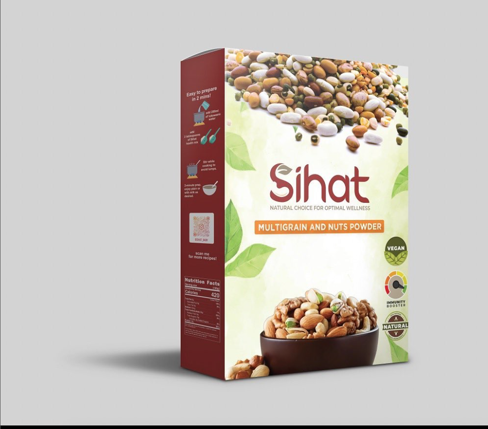
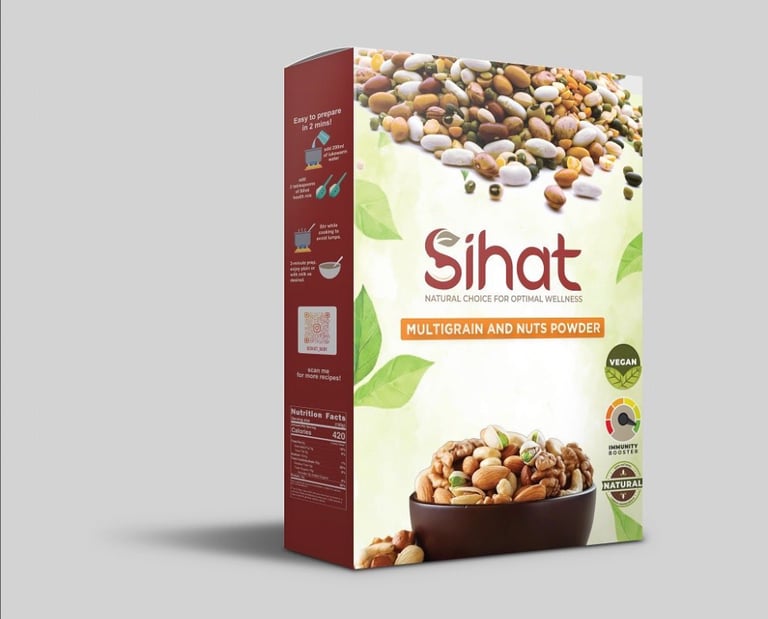
Restaurant
A fine-dining brand in Housten, inspired by a culinary journey across India. The identity captures the spirit of travel, discovery, and cultural richness while reflecting refined sophistication. Flowing letterforms evoke movement and curiosity, mirroring the chefs’ voyage across regions and the fusion of authentic flavors reimagined with modern elegance.

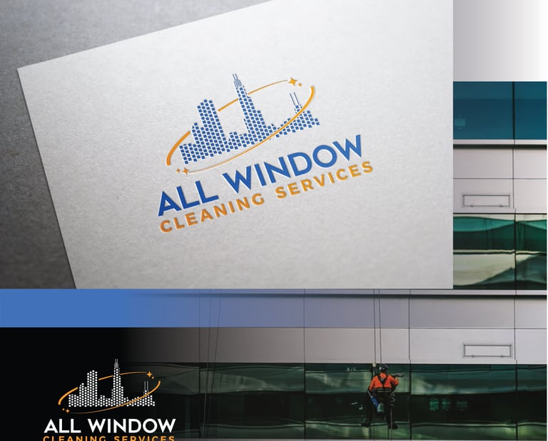
Cleaning & Maintenance
A 50-year-old professional cleaning and maintenance company known for its reliability, safety, and expertise in commercial window cleaning across the U.S. The refreshed identity reflects clarity and precision, values at the heart of their work. The logo features stylized skyline buildings composed of square segments, with a diagonal arc and sparkle symbolizing shine, motion and the company’s enduring commitment to spotless results.


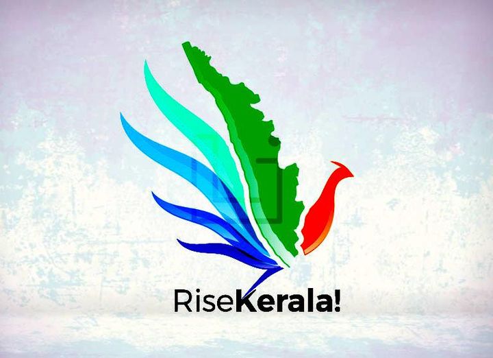
Education
The logo portrays students and educators as birds on a branch, symbolizing mentorship and collaboration. Golden sun arcs evoke hope and enlightenment, while a subtle cityscape connects learning to the community, all set against a blue sky of growth and possibility.
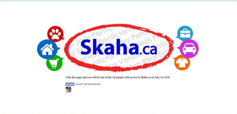
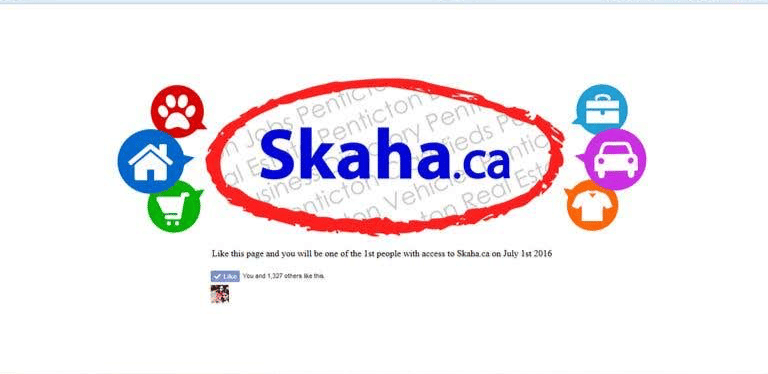
Digital Services & Community Listings
Skaha.ca is a local directory platform connecting Penticton’s community through listings for jobs, real estate, dining, and more. The logo refines their initial concept into a clean, cohesive identity — a connected red oval enclosing the blue wordmark, accented by feature icons representing key categories. The angled gray background text adds local context, resulting in a modern, structured logo that reflects Skaha.ca’s role as Penticton’s central hub for discovery.
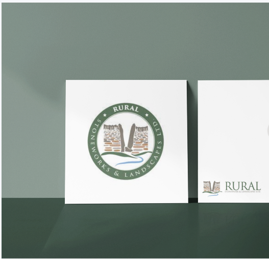
Landscaping & Stonework
Rural Stonework & Landscapes Ltd, a garden landscaping and stonework company based in the rural south-west of England, wanted a logo that reflected their artisanal approach and connection to nature. The goal was to create a design that felt handcrafted and timeless, artistic rather than corporate. Drawing inspiration from the textures of stonework and the natural setting of “The Snicket,” I developed a hand-drawn style logo featuring a gentle stream at its center. The organic lines and earthy tones capture the essence of rural craftsmanship, while the balanced composition of illustration and typography conveys a premium yet authentic identity.